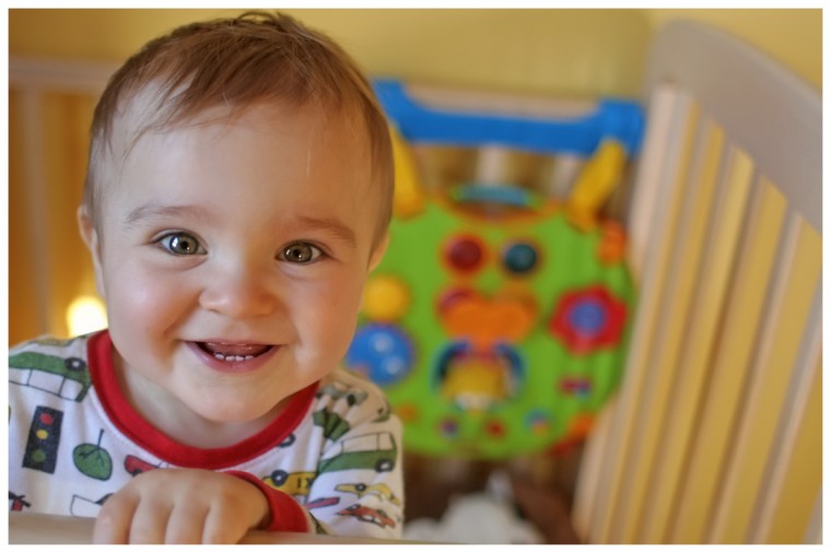
Who likes to work more than play? Nobody, that's who. Sure, work provides us with a sense of purpose and accomplishment, not to mention pays the bills, but if we had the choice I'm sure most people would prefer to play. That is what I have fondness for in kids; Their lives revolve around playing, discovering, imagining and keeping things simple. They can be dirty little money pits but their sense of wonderment often provides a unique perspective that is endearing. If somethings not fun or easily figured out, they loose interest quickly and move onto the next thing. I think website users in the context of searching or navigating are similar in this regard.
I'm not saying that the typical adult web user has the IQ of a three year-old, the point I wish to make is that patience is a rare virtue when it comes to surfing websites and searching for information. We demand web pages to load quickly and heaven forbid if we have to wait for a video to buffer - It's excruciating. Once the website is loaded we will judge it in an instant - Does it look nice? Is it easy to figure out? Does it seem trustworthy? In other words, do we want to "play" with the website? If so, it better not make us think too much because that's work. We need to be instantly gratified. If not, we will move on to something else.
In recent years I have noticed a trend towards playful simplicity. It seems a number of sites being recognized for good usability are those that demonstrate brevity, simplicity, and a casual sense of fun. Some examples I can think of off the top of my head are kontain.com, 37signals.com, and seymourpowell.com. These sites emphasize a focus on good usability design not only from an aesthetics perspective but functionality, as well. The sites look simple, but as legendary graphic designer Paul Rand so eloquently stated "Design is so simple, that's why it's complicated". I don't want to discourage anybody by thinking improving their website to be more usable will be an expensive process; There are some basic principles to follow (10 useful usability tips) and the other parts are making sure your idea or objective is clear and that expectations are modest regarding what needs to be crammed in.
Think of your website or application as a toddler's toy - Simple, looks fun, has readily apparent features, and the learning curve is quick. We're all still kids at heart - Keep that inner child alive by making sure you and others have fun. Besides, who wants to work their whole life? What are your perspectives on usability? I would like to hear from you!
Please submit comments below OR send me an email OR give me a call at 306 229 9437. One more option, I offer an email subscription for receiving new blog updates. Choice is good.
[related-posts]


